Your Union Design System
This is the design system and component library for the University of St Andrews Students’ Association.
A design system is a set of standards and guidelines which you can follow to make your website consistent with the Union’s brand. This means you can spend more time developing the website and less time testing and designing little elements, since you can re-use the work already done here.
This design system uses code from Bootstrap and takes inspiration from the GOV.UK Design System and University of St Andrews Digital Pattern Library.
See also: Your Union Brand Guidelines.
Please contact [email protected] before using this design system in your own work.
Colours
The primary colour of the current page depends on that page’s family.
- Blue (#00AEEF) is used for events, spaces, and entertainment.
- Yellow (#E3B338) is used for representation, SRC, welfare, and equality.
- Crimson (#D91B5B) is used for activities, societies, and volunteering.
- Grey (#3D3937) is used for administrative matters.
You can use the dropdown at the bottom of the screen to switch the primary colour used in examples on this page.
For more information about the Union colour scheme, see the brand guidelines.
Various shades of each colour are available as CSS variables.
| blue-100 | yellow-100 | crimson-100 | gray-100 |
| blue-200 | yellow-200 | crimson-200 | gray-200 |
| blue-300 | yellow-300 | crimson-300 | gray-300 |
| blue-400 | yellow-400 | crimson-400 | gray-400 |
| blue-500 | yellow-500 | crimson-500 | gray-500 |
| blue-600 | yellow-600 | crimson-600 | gray-600 |
| blue-700 | yellow-700 | crimson-700 | gray-700 |
| blue-800 | yellow-800 | crimson-800 | gray-800 |
| blue-900 | yellow-900 | crimson-900 | gray-900 |
Components
These are the components available in the library:
- Button
- Details
- Event row
- Footer
- Forms
- Header
- Heading
- Headline
- Iconography
- Inset
- Notification
- Patterns
- Profile list
- Table
- Tinted card
- Typography
Button
“Button” refers to an element which looks like a button. Semantically, it could be:
<button type="button">or<input type="button">, triggering a JavaScript action,- Even on
<button>elements,type="button"needs to be specified. This is because all MSL pages are wrapped in<form>tags, and the default action of a<button>with no specified type is to act as a submit button.
- Even on
<a class="button">, linking to another page,<input type="submit">, submitting a form,<input type="reset">, resetting a form.
Make sure to use the correct semantic markup for the button.
Button text should be short and accurately describe what clicking the button does. For example “Sign up” or “Buy tickets” would be good button text. “Click here” or “Button” is not.
Keep button text short. It will always appear on one line, so on small screens long buttons may hang off the side of the page.
By default, a button will be a primary button, bordered with the primary colour of the current page.
Example: Primary button
<button>Primary button</button>
<input type="button" value="Primary button">
<a href="#button" class="button">Primary button</a>
<input type="submit" value="Primary button">
<input type="reset" value="Primary button">
You can make a button into a secondary button using the button-secondary class. This will make it a lighter, less prominent variant.
Example: Secondary button
<button class="button-secondary">Secondary button</button>
<a href="#button" class="button button-secondary">Secondary button</a>
<input type="submit" class="button-secondary" value="Secondary button">
<input type="reset" class="button-secondary" value="Secondary button">
Primary and secondary buttons work well next to each other, where you have a ‘main’ action you want a user to take, with an alternative path available.
Example: Pairing buttons for a call to action
<a href="#button" class="button">Book tickets</a>
<a href="#button" class="button button-secondary">Meet the cast</a>
Make a button bigger using the button-large class. Make a button smaller using the button-small class.
Example: Resizing buttons
<button class="button-large">Large button</button>
<button>Standard button</button>
<button class="button-small">Small button</button>
Details
Details elements hide content from a user. This is useful for:
- Making a page easier to quickly read by hiding details which not all users need to see.
- Showing an overview of related content.
- Letting a user hide and show content which is relevant to them.
Do not use a details element for content which every user needs to see. Remember, they hide content, which means that some people may never notice the content exists. Before the details element, first try:
- Simplifying the page and removing unnecessary detail.
- Splitting the content into smaller sections – across multiple pages, or using subheadings. You could then use page navigation components to let a user jump to the section relevant to them.
Don’t put details elements inside other details elements.
Keep the summary text short and descriptive, so people can quickly understand what’s hidden and if they need to open it.
Example
Under 18s entry policy
If you're 16 or 17 and a St Andrews student, you can access the bars after 7pm. If you're a reciprocal member or not a student, you can only access the building if you have a ticket to an event and you let us know in advance.
If you're 15 or younger, you can't come into the bars during term time. Outside term time, you can come in at the discretion of the Personal Licence Holder on duty that night, if you're the child or dependent of St Andrews student.
<details>
    <summary>Under 18s entry policy</summary>
    <p>If you're 16 or 17 and a St Andrews student, you can access the bars after 7pm. If you're a reciprocal member
       or not a student, you can only access the building if you have a ticket to an event and you let us know in
       advance.</p>
    <p>If you're 15 or younger, you can't come into the bars during term time. Outside term time, you can come in at
       the discretion of the Personal Licence Holder on duty that night, if you're the child or dependent of St Andrews
       student.</p>
</details>
Event row
MSL Event List widgets can be displayed as a compact list by adding the event-row wrapper div CSS class in the widget settings.
Footer
The footer is intended as extra navigation, for places which are regularly needed but not headline features of the site. This includes contact information and social media links.
It’s also the place to link to legal documents and make any references which are required on every page of the site – for example, our charity number which must be displayed in line with OSCR rules, and a copy of our privacy policy.
Remember, any content you put in the footer appears on all pages of the site, so make sure the information you’re adding needs to be there.
The footer is separated from page content using the same skyline image as our logo. The skyline and divider match the current page’s primary colour.
Note that the SVG skyline and icons included must be loaded from the same domain as the main page to appear correctly, and may not appear at all in Firefox. This is a security limitation of the <use> element which we have not applied a workaround for yet.
Example
<div class="container footer-skyline">
    <div class="footer-ad">
        <img src="/assets/img/placeholders/728x90-advert.png" alt="Advert">
    </div>
    <div class="footer-skyline">
        <svg viewBox="0 0 1000 455">
            <use xlink:href="/assets/img/skyline.svg#skyline"></use>
        </svg>
    </div>
</div>
<footer>
    <div class="container" data-nosnippet>
        <div class="row">
            <div class="col-md-4">
                <h2 class="plain">Be social</h2>
                <ul role="list">
                    <li>
                        <a href="https://www.facebook.com/StAndrewsUnion/">
                            <svg><use xlink:href="/assets/img/icons.svg#facebook"></use></svg>Union Facebook page
                        </a>
                    </li>
                    <li>
                        <a href="https://www.facebook.com/YourUnionEvents/">
                            <svg><use xlink:href="/assets/img/icons.svg#facebook"></use></svg>Events Facebook page
                        </a>
                    </li>
                    <li>
                        <a href="https://www.instagram.com/StAndrewsUnion/">
                            <svg><use xlink:href="/assets/img/icons.svg#instagram"></use></svg>Instagram
                        </a>
                    </li>
                    <li>
                        <a href="https://www.tiktok.com/@StAndrewsUnion">
                            <svg><use xlink:href="/assets/img/icons.svg#tiktok"></use></svg>TikTok
                        </a>
                    </li>
                    <li>
                        <a href="https://twitter.com/StAndrewsUnion">
                            <svg><use xlink:href="/assets/img/icons.svg#x"></use></svg>X
                        </a>
                    </li>
                    <li>
                        <a href="https://www.youtube.com/StAndrewsUnionTV">
                            <svg><use xlink:href="/assets/img/icons.svg#youtube"></use></svg>YouTube
                        </a>
                    </li>
                </ul>
            </div>
            <div class="col-md-4">
                <h2 class="plain">Contact us</h2>
                <ul>
                    <li><a href="mailto:[email protected]">[email protected]</a></li>
                    <li><a href="/about/contact/feedback">Send feedback</a></li>
                    <li><address>Students' Association<br>
                                 St Mary's Place<br>
                                 St Andrews<br>
                                 KY16 9UZ</address></li>
                    <li><a href="/about/contact">More contacts</a></li>
                </ul>
            </div>
            <div class="col-md-4">
                <h2 class="plain">Bits and bobs</h2>
                <ul>
                    <li><a href="/opening-hours">Opening hours</a></li>
                    <li><a href="/vacancies">Jobs</a></li>
                    <li><a href="/about/policies/privacy">Privacy</a></li>
                    <li>Scottish registered charity, <a href="https://www.oscr.org.uk/about-charities/search-the-register/charity-details?number=19883">SC019883</a>.</li>
                </ul>
            </div>
        </div>
    </div>
</footer>
Forms
MSL wraps every page in a <form> element. This means you don’t need to add your own <form> in the page content, just rely on the wider one provided by MSL.
There are custom styles to clearly display whether each input is valid or not based on the standard HTML5 form validation attributes (like required, pattern, type, maxlength, etc). To avoid showing this validation information while the user is still inputting data, they’re not displayed until the parent <form> has the validated class. This class is added by JavaScript when the form is submitted.
The web browser’s standard validation messages are used to describe exactly what’s wrong with each invalid field. Try to submit the below form to see your browser’s error message style.
Example
<form>
    <label for="name">What's your name?</label>
    <input type="text" id="name" placeholder="" required />

    <label for="story">What's your story?</label>
    <textarea id="story" name="story" rows="4" required></textarea>

    <label for="exampleSelect">What's your favourite venue?</label>
    <select id="exampleSelect" required>
        <option value="">Select one...</option>
        <optgroup label="Performance spaces">
            <option value="stage" >The StAge</option>
            <option value="club601">Club 601</option>
        </optgroup>
        <optgroup label="Bars">
            <option value="main">Main Bar</option>
            <option value="sandy">Sandy's Bar</option>
            <option value="beacon">Beacon Bar</option>
        </optgroup>
    </select>

    <fieldset>
        <legend>Choose your favourite Union floor</legend>
        <label><input type="radio" name="floor" value="floorTop" required/>Top floor</label>
        <label><input type="radio" name="floor" value="floorMiddle" />Middle floor</label>
        <label><input type="radio" name="floor" value="floorBottom" />Bottom floor</label>
    </fieldset>

    <fieldset>
        <legend>What events do you like to come to?</legend>
        <label><input type="checkbox" name="event" value="bop" required/>The Bop</label>
        <label><input type="checkbox" name="event" value="quiz" />Pub Quiz</label>
        <label><input type="checkbox" name="event" value="jazz" />Jazz Night</label>
    </fieldset>

    <label for="fileUpload">Upload a file</label>
    <input type="file" id="fileUpload"/>

    <input type="submit">
</form>
Header
The header is the first element on every page and includes our main site navigation.
The first element of the header is a “Skip to main content” link. This appears when it is focussed – usually by someone browsing the page using their keyboard instead of a mouse – and lets the user jump their keyboard focus to the main page content. To support this, the main section of each webpage should have the main ID.
The navigation is built mostly around dropdowns. Each navigation item is an <li> inside an unordered list. There is a <button class="nav-dropdown-toggle"> which is used to open and close the navigation. It uses the aria-expanded and aria-controls attribute both to aid assistive technology and to help manage the dropdown’s state using JavaScript.
The button has a data-path attribute which includes the base path of this site section including a trailing slash. For example, the “About” dropdown has data-path="/about/". This is used by front-end JavaScript to add the current class and aria-current="page" attribute if the user is viewing a page within that section. We cannot do this server-side because no MSL navigation widget lets you create <button>s.
The currently active section’s dropdown is left open by default when you’re on a page in that section. For example, when looking at the list of societies, the “Activities” dropdown is left open on the page by default. This allows users to more quickly navigate to related site content. JavaScript is used to prevent the dropdown obscuring page content.
Immediately following the button is a <div class="nav-dropdown-container"> containing the dropdown content – usually an unordered list of links, but sometimes things like the search form. It should be linked to the button by the button’s aria-controls tag.
The basket navigation item uses the MSL Basket Link widget to display the current number of items in the basket. CSS is used to hide most parts of the MSL component except the number of items in the basket, which appear like a notification badge atop the basket icon.
CSS is used for as much functionality as possible, so the system works with JavaScript disabled. JavaScript is used to enhance accessibility by managing keyboard focus, open the menus on click instead of on hover or focus, close the menus using the escape key, and make the stripe at the top of the header match the colour scheme of the currently-open dropdown menu.
On smaller screens, the page navigation moves into a hamburger menu. Within the hamburger, the first level of navigation is the top-level categories (“About”, “Activities”, etc), and the second level is the pages within that section. Multi-level dropdowns are not supported in any other way or further than these two levels.
The most accurate example of this is the main Union website, where the navigation items are built from the real MSL components. In the code, the header comprises the <div class="skip-link">, followed by the <header>.
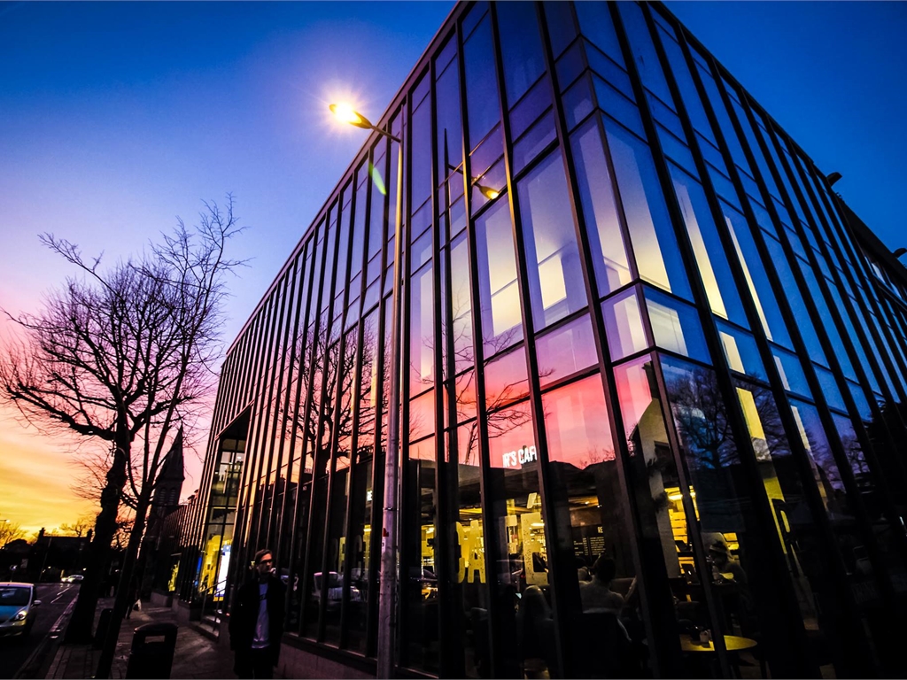
Heading
Headings are automatically inserted on content pages. They have a large, bold title and use the page’s featured image tinted to match that page’s theme colour. The featured image is also the one used for link previews on social media sites and similar. Some spot and stripe décor is added on top and behind the heading for depth.
Example
<h1 class="page-heading">
<div class="page-heading-decor"></div>
<div class="mslwidget msl-pagebanner page-heading-image">
<img src="https://www.yourunion.net/pageassets/testing/test/union.jpg?thumbnail=true&height=768&width=1024&resize_type=CropToFit" height="768" width="1024" alt="Outside view of the Union with the sunset reflecting in the windows">
</div>
<div class="mslwidget page-heading-title page-heading-title-content">The StAge and Club 601</div>
</h1>Headline
The headline appears on the main website homepage and includes key items we want to feature, such as big events or offers.
It is made of 1200x630px images, displayed in a grid pattern, and is based on the markup of the MSL News List widget with the headline class.
- If there is one headline, it appears as a single image taking approximately the width of the page container.
- If there are multiple headlines, the headline is split into three columns. The first headline takes two units of width and height, in the top left. Other news then appears around it, taking up one unit of width and height each.
Example: One headline
<div class="mslwidget headline pb-2">
<div class="msl-item-list msl-news">
<div class="msl-item" data-msl-organisation-id="6013" data-msl-tags="">
<a href="#" title="News 1" class="msl-image">
<img src="/assets/img/placeholders/1200x630-headline.png" height="630" width="1200" alt="" loading="lazy">
</a>
<h3 class="msl-title"><a href="#" title="News 1">News 1</a></h3>
<div class="msl-item-details">
</div>
</div>
</div>
<div class="killfloat"> </div>
</div>Example: Three headlines
<div class="mslwidget headline pb-2">
<div class="msl-item-list msl-news">
<div class="msl-item" data-msl-organisation-id="6013" data-msl-tags="">
<a href="#" title="News 1" class="msl-image">
<img src="/assets/img/placeholders/1200x630-headline.png" height="630" width="1200" alt="" loading="lazy">
</a>
<h3 class="msl-title"><a href="#" title="News 1">News 1</a></h3>
<div class="msl-item-details">
</div>
</div>
<div class="msl-item" data-msl-organisation-id="6013" data-msl-tags="">
<a href="#" title="News 2" class="msl-image">
<img src="/assets/img/placeholders/1200x630-headline.png" height="630" width="1200" alt="" loading="lazy">
</a>
<h3 class="msl-title"><a href="#" title="News 2">News 2</a></h3>
<div class="msl-item-details">
</div>
</div>
<div class="msl-item" data-msl-organisation-id="6013" data-msl-tags="">
<a href="#" title="News 3" class="msl-image">
<img src="/assets/img/placeholders/1200x630-headline.png" height="630" width="1200" alt="" loading="lazy">
</a>
<h3 class="msl-title"><a href="#" title="News 3">News 3</a></h3>
<div class="msl-item-details">
</div>
</div>
</div>
<div class="killfloat"> </div>
</div>Iconography
Icons are from Font Awesome Free. We don’t load the entire library, just the icons we need in some SVG sprites.
Example
<svg><use xlink:href="/assets/img/icons.svg#search"></use></svg>The SVG <use> tag (a common way of loading SVG sprites) will only load content from the same domain in most web browsers, so the sprites need to be hosted on the same system as the main site. Additionally, Firefox will only load the content if it’s in the same subdirectory, which means some icons aren’t currently displayed in that browser. This is a known issue.
Inset
Insets can be used to draw attention to a piece of information. Keep them extremely brief and use them very rarely, so they maintain their impact.
Example
<div class="inset">
    Please contact us before using this Design System in your own work.
</div>
Notification
Notifications are used to show the status of actions in the interface. Most of these are automatically generated in MSL so we don’t have any control over the markup.
Generally, there is an outer div.msl_notification with an inner span.<error type>. All styles we define here need to override the MSL system styles.
MSL tends to use .msl_info for both success and info messages, and .msl_warning, .msl_error, and .error for both errors and warnings.
Example: Info notification
<div class="msl_notification">
    <span class="msl_info">Ticket added to basket.</span>
</div>
Example: Warning notification
<div class="msl_notification">
    <span class="msl_warning">Be careful!</span>
</div>
Example: Error notification, markup A
<div class="msl_notification">
    <span class="msl_error">Product per-person limit reached.</span>
</div>
Example: Error notification, markup B
<div class="msl_notification">
    <span class="error">Product per-person limit reached.</span>
</div>
Example: Error notification, markup C
This product has the following requirement(s):
- Membership of 'University of St Andrews Students' Association - students invited to graduate 2022'
<div class="error">
    <h4>This product has the following requirement(s):</h4>
    <ul class="basket_qp">
        <li>Membership of 'University of St Andrews Students' Association - students invited to graduate 2022'</li>
    </ul>
    <div class="msl_notification">
        <span class="msl_warning">Sorry, there are no qualifying products available.</span>
    </div>
</div>
Patterns
Various patterns are available as page décor. Use a Bootstrap-type background colour utility class along with the class for the pattern you’d like on a <div> or similar, then the element where you’d like the pattern.
Example: Striped background
<div style="width: 100%; height: 75px" class="bg-primary-500 bg-stripe"></div>Example: Spotty background
<div style="width: 100%; height: 175px" class="bg-primary-500 bg-spot"></div>Profile list
The Profile List component is created by adding the profile-list class to the MSL Image Navigation widget. It includes the page image in a square, the page title, and description laid out in a grid and is intended for lists of people, like the Officers page.
Table
Tables should be made of standard semantic HTML, including headers, bodies, and footers as needed.
Example
| Pay date | Start of included days | End of included days |
| 28 January 2022 | 6 December | 9 January |
| 25 February 2022 | 10 January | 6 February |
| 30 March 2022 | 7 February | 6 March |
<table>
    <thead>
        <tr>
            <td>Pay date</td>
            <td>Start of included days</td>
            <td>End of included days</td>
        </tr>
    </thead>
    <tbody>
        <tr>
            <td>28 January 2022</td>
            <td>6 December</td>
            <td>9 January</td>
        </tr>
        <tr>
            <td>25 February 2022</td>
            <td>10 January</td>
            <td>6 February</td>
        </tr>
        <tr>
            <td>30 March 2022</td>
            <td>7 February</td>
            <td>6 March</td>
        </tr>
    </tbody>
</table>
Tinted card
Tinted cards are an alternative layout of the MSL Image Navigation component and include big, bold buttons with the page name and description (if enabled in the widget settings), and a tinted version of the page’s image.
To use tinted cards, add the tinted-cards class to the wrapper div CSS of the Image Navigation widget. You can make a widget including all pages below a certain page in the navigation tree, or based on a custom navigation section configured in Website Admin. In the latter case, you can use the medium and large classes to make the buttons two or three units tall respectively, or any colour class (crimson, yellow, blue, or gray) to change the button tint colour. (The small class does nothing, but is sometimes included in markup for clarity). When laying out custom navigation, the tinted-cards-fill-columns class on the wrapper div will change how the items flow into the grid and may make some layouts easier to make.
Example: Tinted card navigation using custom navigation section


<div class="mslwidget tinted-cards tinted-cards-fill-columns">
<ul class="msl_navbar">
<li>
<a href="/activities/societies/" class="crimson large">
<img src="https://www.yourunion.net/asset/Navigation/11/65ad6e78fdea4606bd9c9b7a896188eb.jpg?thumbnail_width=400&thumbnail_height=400&resize_type=CropToFit" class="nav-icon" loading="lazy">
<span class="nav-text">Societies</span>
</a>
<span class="msl-nav-description">Meet people, do stuff.</span>
</li>
<li>
<a href="/about/opening-hours/" class="blue medium">
<img src="https://www.yourunion.net/asset/Navigation/11/daeaadd5e111483883e10456753187b2.jpg?thumbnail_width=400&thumbnail_height=400&resize_type=CropToFit" class="nav-icon" loading="lazy">
<span class="nav-text">Hours</span>
</a>
<span class="msl-nav-description">Is the Union open?</span>
</li>
<li>
<a href="/spaces/book/" class="blue small">
<img src="https://www.yourunion.net/asset/Navigation/11/019dc85b4a964833beece01fa77413c2.jpg?thumbnail_width=400&thumbnail_height=400&resize_type=CropToFit" class="nav-icon" loading="lazy">
<span class="nav-text">Book a space</span>
</a>
<span class="msl-nav-description">Hold an event or meeting.</span>
</li>
<li>
<a href="/support/" class="yellow large">
<img src="https://www.yourunion.net/asset/Navigation/11/d013055f58034d9ca3db692bc1bfdaff.jpg?thumbnail_width=400&thumbnail_height=400&resize_type=CropToFit" class="nav-icon" loading="lazy">
<span class="nav-text">Support and safety</span>
</a>
<span class="msl-nav-description">Academic and personal help.</span>
</li>
</ul>
</div>Typography
All text content is set in Gotham. The book weight is used for body text, bold is used for headings or emphasis, and the light weight is also available.
Text should never be underlined. Underlines are only used for links.
BLOCK CAPITALS ARE HARD TO READ AND FEEL LIKE YOU’RE SHOUTING. Write in sentence case instead, making use of italics, bold text, highlights, or the inset component for emphasis.
Dividers
Use a horizontal rule to add a visual divider to page content. Do not re-create the line with dashes or hyphens.
Example
Plus, we'll have food vendors on site!
The event starts at 10pm, with last entry at midnight.
<p>Plus, we'll have food vendors on site!</p>
<hr>
<p>The event starts at 10pm, with last entry at midnight.</p>
Headings
Each page should only have one level 1 heading. When creating subsections, heading levels should never be skipped – for example, direct subsections of a heading 2 must be titled with heading 3s.
Example: Good practice
Heading 1
Heading 2
Heading 3
Heading 3
Heading 2
Example: Bad practice
Heading 1
Heading 3
Heading 4
Heading 1
Heading 2
If a page doesn’t look right with the correct heading levels, do not change the heading levels. First, consider if you can re-structure your content to improve the balance of the page. If this isn’t possible, use CSS classes to make one level of heading look like another.
Example: Heading 4, with the appearance of a heading 2
Larger heading
<h4 class="h2">Larger heading</h4>You can remove the detail under a heading using the plain class. Heading 1s never have the detail.
Example: Heading 2, with no detail
Plain heading
<h2 class="plain">Plain heading</h2>Headings should only be used as titles, never to emphasise or enlarge text. If you need to emphasise something, look at the inset component, use bold or italics, or restructure your content to make the information you need to emphasise more naturally-prominent.
Lists
Ordered and unordered lists can be displayed without bullet points or index numbers by adding the list role.
Example: Unordered list without bullets
- Rector's Cafe
- Old Union Coffee Shop
- Saints Spresso
<ul role="list">
    <li>Rector's Cafe</li>
    <li>Old Union Coffee Shop</li>
    <li>Saints Spresso</li>
</ul>